In this article, I am going to give you some scrapbooking page layout ideas specifically relating to giving your scrapbooking pages that antique or vintage look and feel. The aged look is very popular when it comes to scrapbooking, as it adds interest to your album and it makes the reader feel as if they are going back in history.
I love this look, especially when I scrap old photos of my grandparents and parents growing up. There’s just something about looking at old photos and feeling as though you stepped into the past.
Scrapbooking Page Layout Ideas
The Aged Look
When I started scrapbooking, I had a lot of old black and white photographs, and I used a lot of these ideas for my projects to give them that aged or antique look. Using black and white photos gives your page that vintage look without you even having to try.
I like to change my photos to sepia or black and white to get that vintage style look on my phone before printing them out.
Be selective in regards to paper color as you as you design your vintage layout. Paper you use should not be too bright and bold. Adding a little color as an accent is fine, but don’t let a color overpower the page. The majority of the layout should be neutral, brown, gray or green.
Using Flowers
For some reason, flowers make us think of the past, especially roses. Using floral prints can give your page that aged look and is a great scrapbooking page layout idea if you want to add some nostalgia to your layout.
I sanded these flowers lightly before adding them to my layout.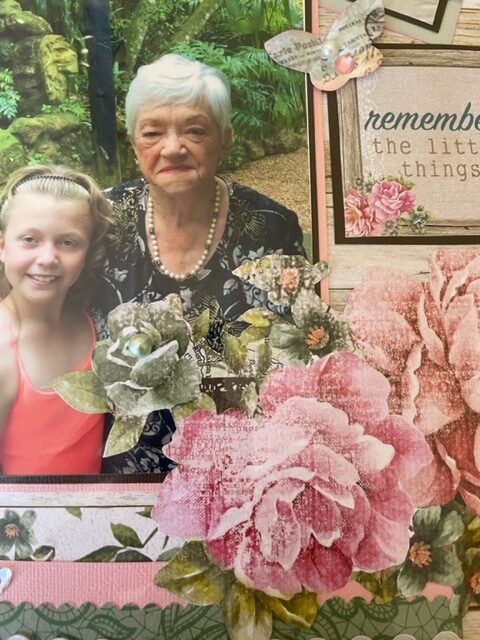
Crumpling
Sometimes using a brand new crisp sheet of cardstock just doesn’t suit the old photographs that you want to use on your layout. There are loads of great scrapbooking page layout ideas to get an aged or distressed look to your layouts. There are also a number of manufacturers producing printed designs that recreate a distressed look, but it is much more fun and cheaper to create your own.
The easiest way to distress or age paper is to simply crumple it up. Take the page with both hands and crunch it up into a ball. The tighter the ball, the softer and finer the finished crumples will be. Next open out the paper and smooth it down.
You can then create different effects by either applying glaze for a shine or inking lightly over the crumples to create a piece that looks 100 years old. If you want a smoother result, try ironing the sheet with a dry iron set to medium heat.
You can use this crumpled paper to either frame your photos or as a background. Try cutting out some embellishments for your page using the crumpled paper, as this can also look stunning. Here I cut out the letters from crumpled and inked paper.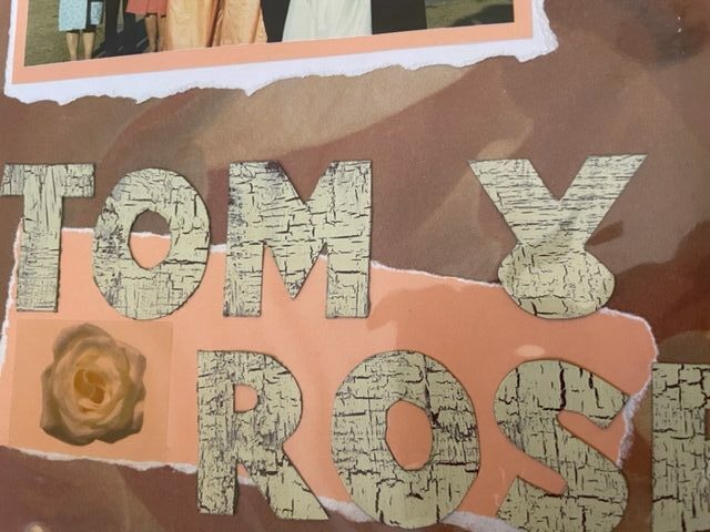
Tearing
If you look at old newspapers or documents you will notice that the edges are never straight and flat. You can recreate this effect by using the tearing technique.
If you tear the paper towards you, the core of the paper is revealed, and you can highlight the edges with inks or chalks.
If you tear the paper away from you, the edge will be cleaner and sharper. You can also try curling these edges inwards for an authentically aged effect.
Sanding
Another scrapbooking idea is to lightly sand the surface of the paper with fine sand paper to remove bits of the finishing of the paper here and there. Paper or cardstock with a white core will work better for this technique. You can also combine sanding and the crumpling technique.
Burning
This one works well, but don’t do this on original photos. Light a candle and lightly burn around the outside of the photo or the photo matting. This makes the paper black and instantly gives that aged look to the project. You can achieve the same effect by tearing the edges and inking them with a black ink block.
Inking
Most old documents are yellowed with time. You can achieve this same effect by using the direct to paper inking technique.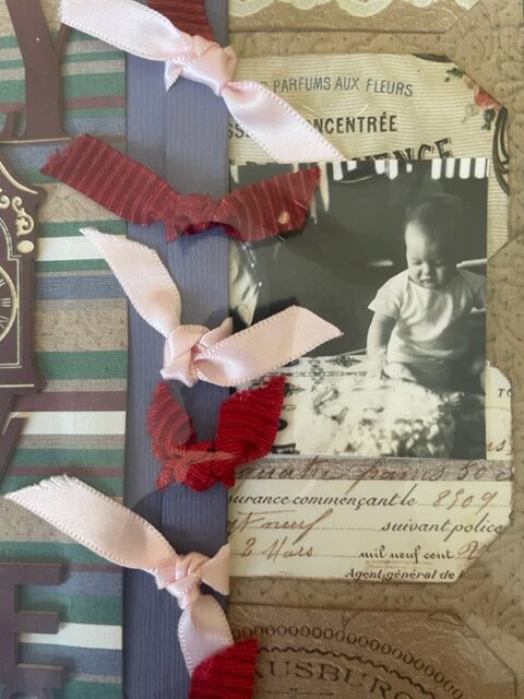
Do this by applying the ink pad directly to the paper, obviously using tan or brown ink. Start by using a light touch of ink here and there, and darken if necessary.
Other colours can also be used for this technique, and white is also excellent for a soft cloudy finish.
Try using a thick makeup brush to apply the ink in a swirling fashion. This will highlight the texture of the paper, or any embossing in the paper.
When creating the aged effect, don’t used brightly coloured card, but if you have to and you want the layout to look aged, you can apply walnut or brown inks to tone the colours down to produce effects that look as though they have occurred naturally over time.
Printing Photos On Paper
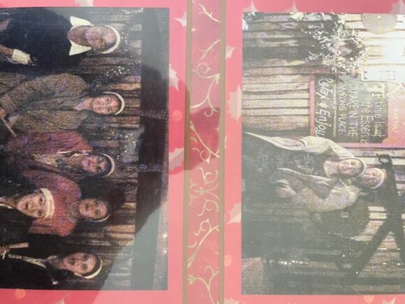
If you print your photos onto regular paper instead of photo paper, the effect is that of old faded photographs. In fact there are a lot of things you can do to edit your photos before you print them to make them look old. Any good editing program will help you with this. These two photos below were printed on paper.
Using Embellishments
Another of my scrapbooking page layout ideas is to use old embellishments that you have collected over the years like old jewellery or brooches.
This will add a personal touch to your layouts, especially if the trinket belonged to the person in the photographs.
There are many aged looking embellishments that one can purchase, but it is much better if you can find your own personal ways to add to the character of the page.
Cut Outs On Pages
This isn’t necessarily an aging technique, but I use it a lot because you can make it look aged and add more interest to your layouts.

For more on scrapbooking and scrapbooking page layout ideas, click here.
