Many crafters and artists often think or wonder about how to use color in art and how this can enhance their artworks. Here are some ideas on planning your colour choices for your next artistic project.
How To Use Color In Art Like Painting or Drawing
You can enhance your painting by planning out your colour choices before you begin, as color choices can affect the harmony and composition of your final product.
Remember there is no right or wrong when creating an art piece, as everyone’s tastes are different, and what may look wonderful to one person will look terrible to somebody else.
Think about the following when thinking about how to use color in art:
- Do you want colours to harmonize or be contrasting?
- How can you use color to unify your scene?
- Will the colours you use create a visual path for the eye?
- Which parts of the painting do you want to emphasis?
- Do the colour choices make sense?

Our lives are full of cascading and contrasting colors. Color is a beautiful language that can express volumes in a single glance.
How to use color in art is a language without boundaries and colour can be used to communicate with anyone.
Here is a list of some of the color meanings.
RED – love, romance, excitement, energy
PINK – delicate, feminine, romance, baby
ORANGE – sunsets, autumn, warmth
YELLOW – happiness, sunshine, energy
BLUE – water, cool, fresh, tranquil
GREEN – nature, growth, abundance
BROWN – neutral, warmth, timeless
PURPLE – solemn, elegant, faith, royalty
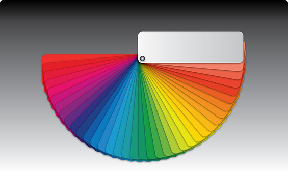
Using the color wheel also helps when thinking about how to use color in art.
There are three primary colors -: Red, Yellow, and Blue.
You can use these primary colors as a base to make just about any other colour on the spectrum.
For instance, you can mix red and yellow to make orange.
You can mix red and blue to make purple.
You can mix yellow and blue to make green.
Now add a bit of black or white to create different hues of colour.
Purple, orange, and green are called secondary colours, and you can create even more colours using these again.
Each one of these secondary colors can be used next to a primary color to compliment it. This, of course, can create a rather garish piece if you do this in your art, but it is a great way to emphasize something or make it stand out.
You can again mix primary and secondary colours to make tertiary colors and these are more the colors you will paint with, as they look more natural and you see them all around us in nature.
If you use colors next to each other on the colour wheel, these colors usually compliment each other well.
How to Use Color In Scrapbooking
The best thing to do when choosing the main color for your monochromatic scrapbooking scheme is to look at the colours on the photograph that is being used.
Use the color that stands out in the photo as your main colour. Ask yourself what mood is being created in the photograph. Is it cool and tranquil or warm and energetic?

Sometimes it can be challenging to match your base color in a cardstock, so you could also consider changing the photo to black and white, as these are not considered colours and any colour will, therefore, go with them.
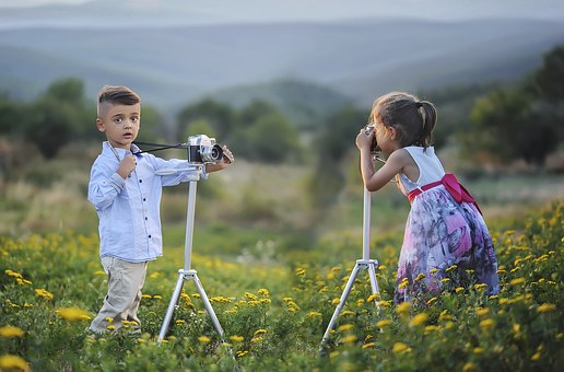
If I had to matt the photograph above, I would do so in yellow and then use green as my background colour for my layout. But somebody else may choose blue or white.
You could also print out your photo with tints and shades of your monochromatic color scheme for an exact match.
The word monochromatic comes from the Greek word mono, meaning one and chroma, meaning surface. Try exploring using one colour on your layout and then adding interest by varying the tints and shades of that same colour.
Another effective idea is to have your photograph as the central point of interest on your page, and then use all your monochromatic colors around it in different ways. Keep the Journaling in the same color, but make sure that it stands out by using a darker color against a light color or vice versa.
Make sure to do some research into colours and the ways in which they can enhance your skills as a page designer.
You can use the world we live in as an inspiration for yourself. Think of how beautiful the spring blossoms look, or the autumn colors. Look at magazines and see how monochromatic schemes are used to get scrapbooking ideas for your layout.